The Fino design team felt strongly that the blog’s design didn’t represent the skills of our department or the culture of our company. We used a one-week Design Sprint, where we spent 1-2 hours a day redesigning the Fino Blog with the following goals in mind:
- Create a design for the Fino blog that represents the strengths of the design team and company culture
- Execute the team process in an ambitious, abbreviated time frame
- Present process, learnings, and design to the entire company at the end of the week
Problem:
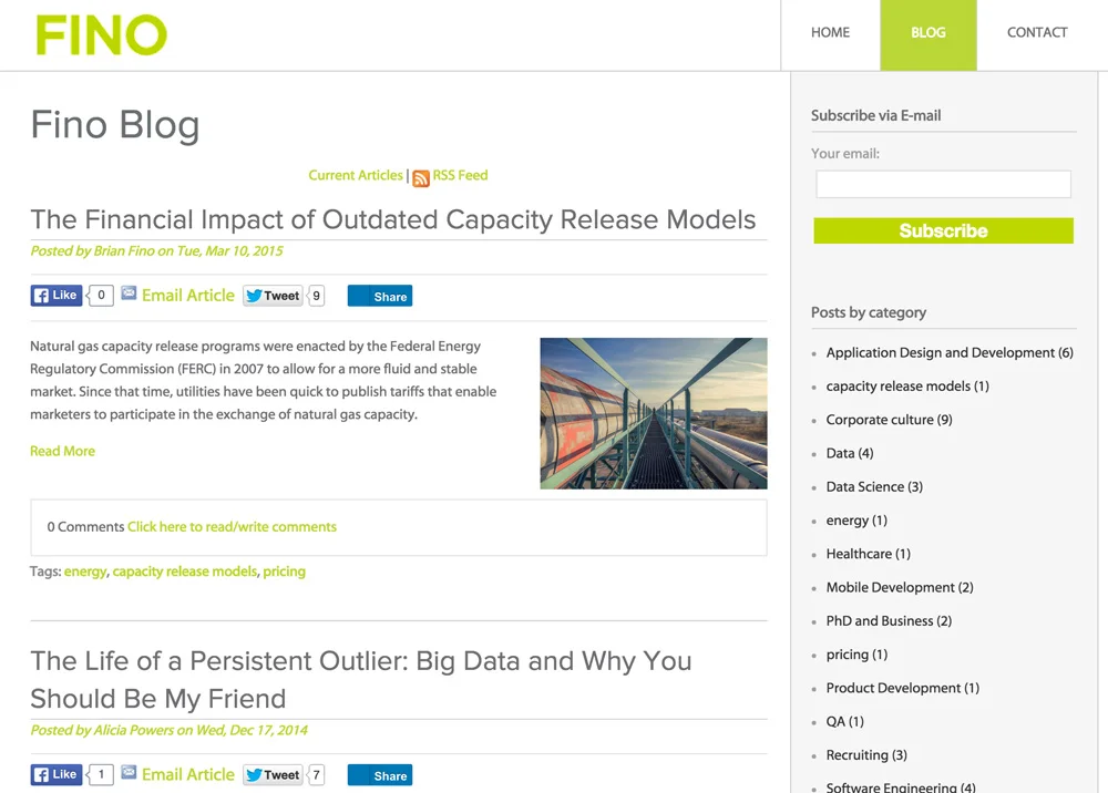
Current company blog did not reflect company brand, culture, or talent.
Strategy
Monday: Competitive Analysis & Requirements Gathering
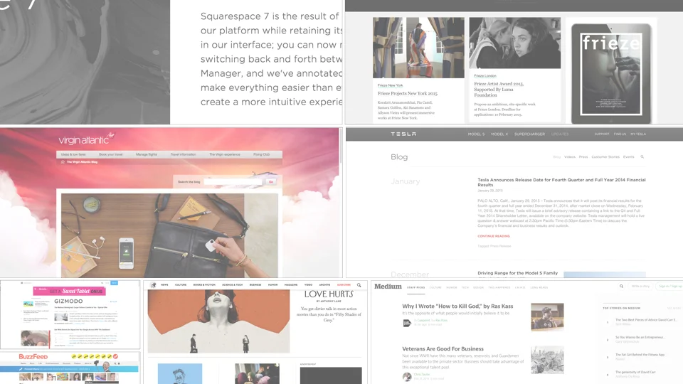
Team members individually survey blogs, looking for best practices, innovative design, etc. Each person to be assigned one of the following: corporate/company blogs, general interest blogs, digital magazines, blogging platforms, design/UX research pertaining to blog best practices
Team shares findings and discusses
Team develops a set of requirements for the Fino blog based on findings
Tuesday: Ideation & Sketching
Review requirements from Monday meeting
Individual sketching time
Group white boarding and sketching; should culminate with a shared central vision
Split in to two groups to flesh out remaining details, based on shared vision
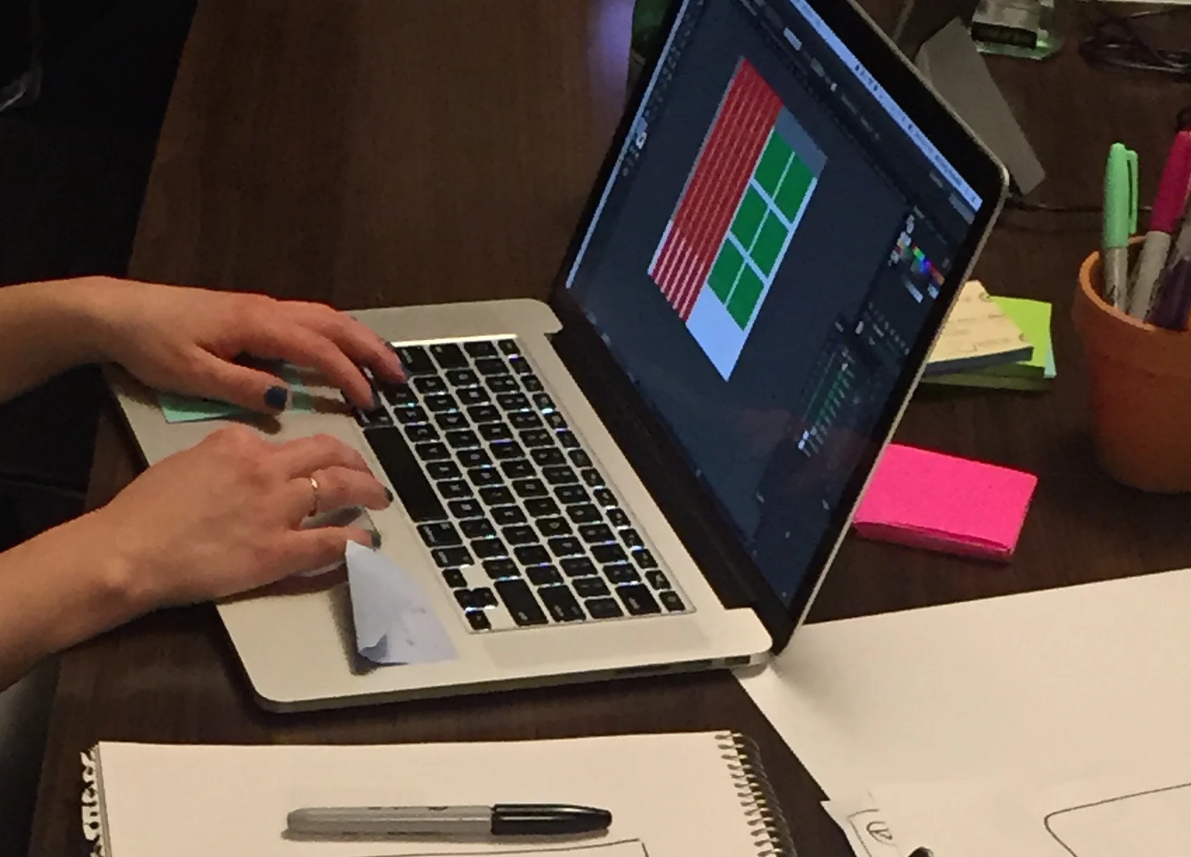
Wednesday: Prototyping
Divide and conquer—one group works on the landing page, the other the article pages
Execute plan
Complete a prototype that can be utilized for user testing
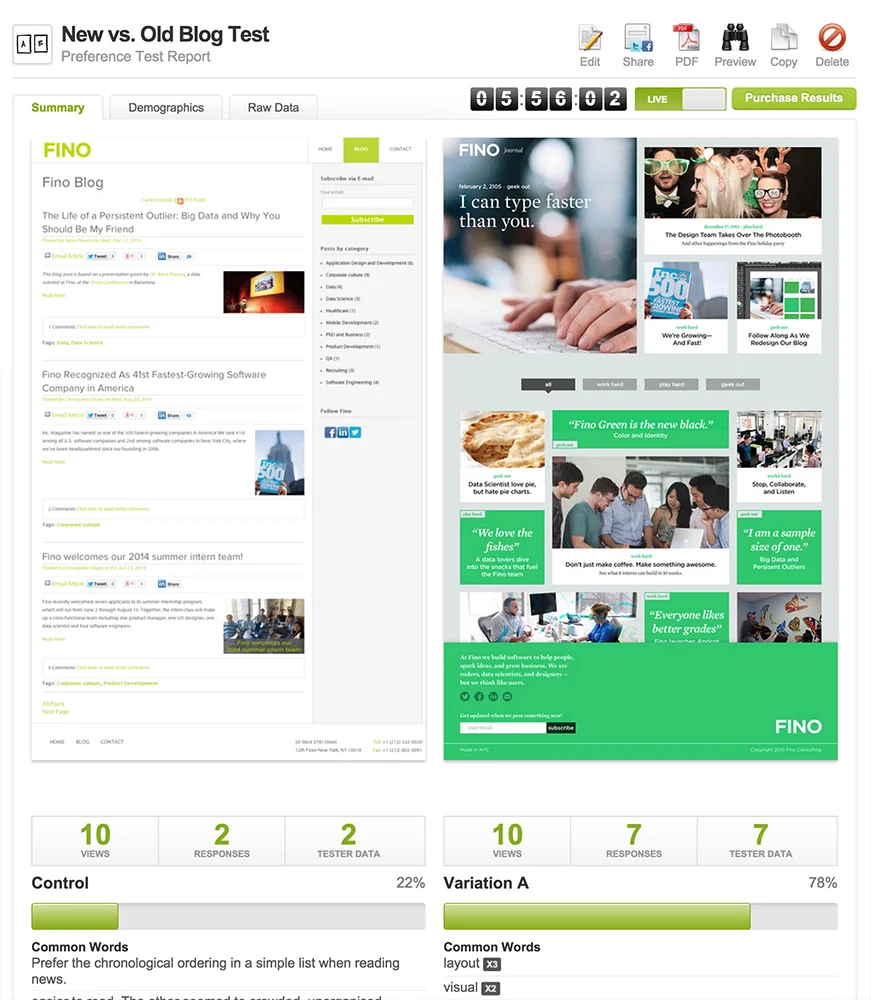
Thursday: User Testing
Whole group learns how to use verifyapp.com
Set up various tests as a group: A/B testing, menu, feedback, etc.
Friday: Iteration
Review results of user testing
Define any guiding principles based on testing results
Determine how we want to update designs
Discuss how we want to share with the rest of the organization
Research Findings / Blog Requirements
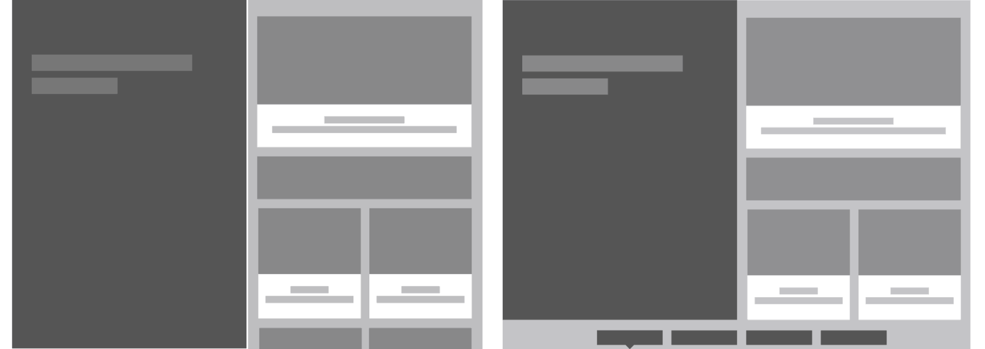
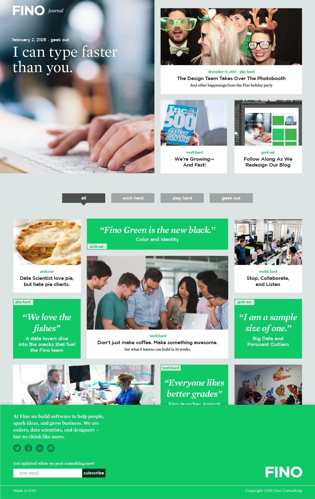
Landing Page
1 big call to action (similar to: Huge.com/ideas)
Include summary of the article topic. Summary will be written specifically for this purpose (similar to: NYMag)
Curate a set of content categories. This is not the same as tags—tags are dead
Information hierarchy will make or break this page
Avoid visual clutter
We are positioning ourselves as experts speaking to our peers
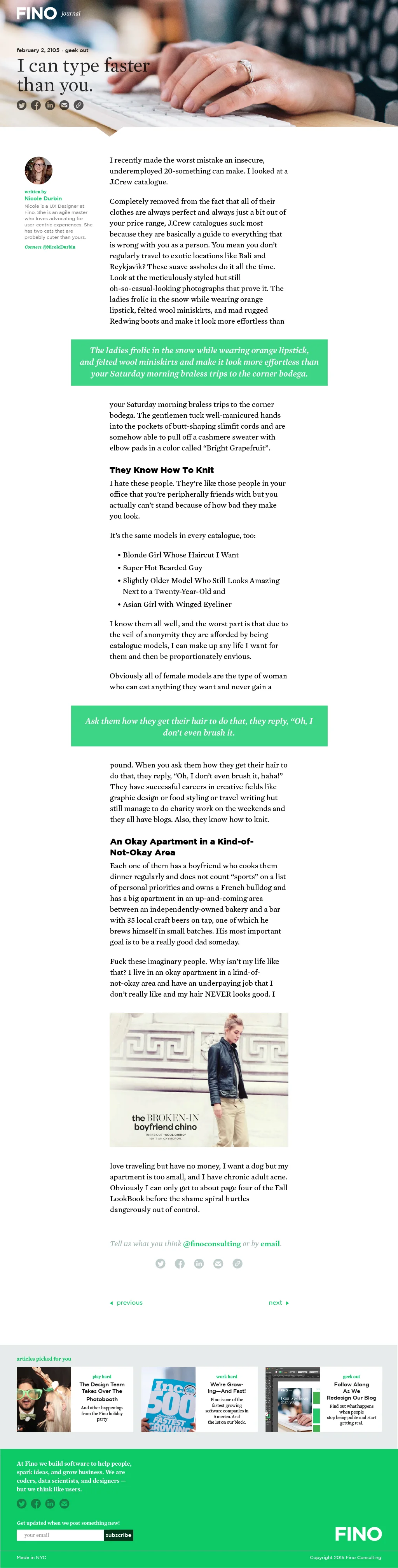
Articles
Follow general guidelines for content usability: Big fonts, big margins, lots of space between chunks of content
Content authors should use bullet points in their writing to improve readability/skimability
Use design elements to improve readability/skimability, potentially for things like block quotes, executive summary, key takeaways, etc.
Author photos
No comment section, instead encourage sharing via Twitter
Author contact information
DON’T CALL IT A BLOG. Ideas for section name:
Ideas
Thought Leadership
Journal
Concepts